 | ![]() | | Illustration: Stevie Remsberg | | | | Welcome back to Queries, our ongoing exploration of style and grammar hosted by me, New York copy chief Carl Rosen. This week, features editor Ryu Spaeth and I discuss how to style the names of magazines and newspapers. |
| A recent Wall Street Journal post about copyediting opined on the styling for New York Magazine. Is there a proper way to style our name? |
| Kudos to the Journal for supporting its copy editors with a column and to its copy editors for making interesting choices, though more interesting to me is the timing of the ruling, which reads: |
| “New York magazine, with a lowercase ‘m,’ is the style. We uppercase Magazine only if it is part of the publication’s formal title, including WSJ. Magazine. (New York magazine is a tricky one since it uses Magazine in some labels, but not on its cover, unlike Harper’s Magazine, which we do present uppercase.)” |
| |
| Perhaps they took us on because a pneumatic tube deposited copies of our mediacentric “Power Issue” into the wicker baskets on their felt-top desks? (I would have loved to be there when they encountered our respectful full-name styling of their own paper’s name, down to the initial-capped and italic The.) Again, their style is their choice, but the claim that ours is a “tricky” case is persiflage and gaslight. I do not exaggerate: The very issue — “Vol. 57, No. 22” — upon which they in green eyeshade and sleeve garters gaze contains the mandatory periodicals circulation notice for the U.S. mailman, the annual PS FORM 2526 on page 104, which “labels” (for readers as well as perusers of the alluded-to PS Form 3541) our “Publication Title” as New York Magazine. That it’s legally so and typographically unstyled is significant: The name New York on the cover is a logo, a registered mark (note the ® by the K’s right arm). It’s the famous design by the fabulous Milton Glaser and beautiful enough to be ripped off constantly (cf. suss Canal Street gimme caps, dollar-shop T-shirts, jailhouse skin art & cetera). You likely won’t find many cease and desists related to the WSJ. magazine logo (and yes, we drop Magazine from the titles of magazines that use the term on the cover; it’s a favor to publications burdened thus. People say Harper’s! It’s not quite the rookie mistake of “labeling” a table of contents “Table of Contents” — it should be “Contents” — but it’s up there. Then again, there are good reasons to append Magazine to a title, as our friends at The New York Times Magazine would argue; furthermore, I endorse italics for apps, such as New York Times Cooking, which could refer to a multiplicand I can get behind!). |
| In fact, the full name of our magazine can be found fortnightly on another form that we refer to as “index copy,” which I suppose one can call “a label.” This is the tiny type crawling up the right margin of “The New York Crossword.” There, opposite the Down clues, you’ll learn we are New York Magazine (ISSN 0028-7369). This is part of the information required by dint of Postal Lawgivers of all print periodicals in every issue; placement of such blether, rigmarole & cetera has to be within two editorial pages (a double-sided piece of paper for legal purposes) of the end of the book (or the beginning), thank you. |
| That said, the styling of the name is just style. Publications reserve the right to refer to themselves as they see fit. The issue for us is less of capitalization than of context. Most magazines italicize titles of publications in their pages, and newspapers don’t. Magazines often have a one-off style for themselves. Time magazine uses caps when referring to itself (TIME). URLs, including that of the Journal, use lowercase letters (wsj; ours is nymag); I see that the Journal uses the capped WSJ in-house. We use NYMag informally, usually to describe combined web and print operations. Our marketing people are free to use New York, NYMag, New York Magazine, and (gasp) New York magazine (for example, if you’re discussing “New York magazine and web products,” the lowercase term makes sense). You can also use New York Magazine and New York sans itals if, for instance, the typeface employed has no italic font, as is often the case in house ads or promotional material. We might use New York Magazine as a sort of royal we. But, as ever, it’s crystal clear which magazine you’re talking about if you italicize New York. Otherwise, you might think the reference is to one of the 50 states, or half of a city so nice they named it twice, or a state of mind. |
| Confusion of referent can be a real issue for us. Right now, when, say, the Times picks up on one of our scoops, the text will note something like “a New York reporter says” or even “in a New York magazine story,” which still looks like the Gray Lady overheard someone grousing at Schnipper’s and deigned to write it down. I mean, almost everything comes from a New York reporter or a New York magazine. It’s a very large mediascape here. So it seems to me a paper would want to attribute thus: “according to a New York Magazine reporter”? Or is the confusion intentional, driven by jealousy or snobbery or general contempt? Better angels say no. |
| The lack of italics is a feature (or flaw) of newspaper style. Carrying over 19th-century typographical practices, papers tabloid and broadsheet continue to rely on roman caps for proper names. This practice is overripe and might have tasted sweetest just at the point of rotting, but we prefer to go with the fresh fruit of italicization of periodical titles. Just for the record: If a newspaper insists on extending the reign of the roman empire, we prefer that it use our full name, with initials capped — even on Magazine — when we’re name-checked for clarity of sourcing. |
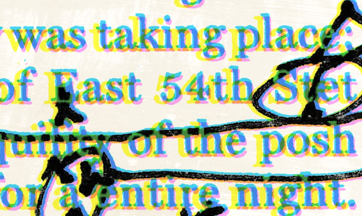
 | ![]() | | Photo: Jacob Moscovitch/New York Magazine | | | | So what is the deal with newspaper names? I’ve noted we leave city names of papers in roman. Why do we do this? |
| Names of papers are set in italic (the Daily News, the Times-Picayune, Newsday), associated place names in roman (the Los Angeles Times, the New York Times, the New York Post, the Washington Post). (Our midwestern colleague Reeves Wiedeman might know there was once a Carbondale, Kansas, broadsheet called Reub Playford’s Astonisher and Paralyzer.) |
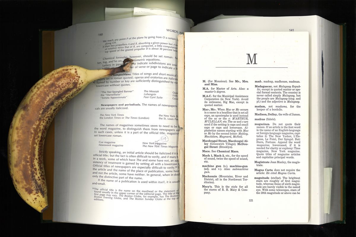
| Apocryphal place names are considered part of a paper’s name, so we italicize them (e.g., The Wall Street Journal, which is not produced on Wall Street; I take the 2 or 3 train to Wall to get to New York’s offices and have yet to encounter a single newsie); papers for similarly imaginary communities are set in italics, as one would a work of fiction — Harvard Crimson, Columbia Daily Spectator, SUNY-Binghamton Pipe Dream, Chicago Maroon (which is named for the U. of, not the City of Broad Shoulders) — same with journal titles (The Yale Review). This style is based on the stalwart guide Words Into Type (1974), but we’re not entirely faithful to it. |
| It has become an oddly charged issue, and I’ve been called vindictive for its strict application. Rather than go down the history well, I’d use the same sort of qualification given by the Journal’s style column: “That said,” as they say, there’s always room for requested exceptions. |
| Every week, we’ve shared a question from our copy quiz and discussed your answers as posted in our Queries Discussion thread. Here’s the solution to last issue’s test question, the final one for this cycle of the newsletter (next issue will be devoted to answers to readers’ queries). |
| Instructions: Make corrections to the sentence below. Mark it up as you please. Feel free to rewrite or add queries. Change as much or as little of it as you see fit. (It’s not a trick — some things are dreadfully wrong with it.) The point is to show what you can do. |
| Last Week’s Question: How is a child who is only ten years old to know that he has a lot less problems to worry about than does his Dad? |
| Answer: “Freaks of idiom.” It’s hard to forget an example characterized thus, and I would hardly expect to hear it invoked by a prospective copy editor, yet that’s my visceral response to reading this creep-show question; after all, the first style guides we read have time-traveling tentacles. So to apply a rule from a Reference Book H.P. Lovecraft Likely Used™, I would change the age descriptor to “a child of ten” (critics of this idiom, as Fowler’s describes it — meaning those who think the phrasing is logical and not just written for grins — maintain that the of is “not partitive but appositional”). Nevertheless, our house style would call for a more succinct solution (and a numeral for a human’s age BECAUSE), since we are all busy readers and have no time for the doubly identified young’un: “a 10-year-old.” Next up, there’s the less/fewer issue to resolve, which is obfuscated by the “lot” modifier and made worse by the verbiage dropped before Dad, who is “his dad” (lowercase common nouns, please). So I’d go with something like “How is a 10-year-old to know he has fewer problems than his dad does?” You might also ask the editor to tell us what the father is worried about and how our writer knows what’s going on in the mind of a child. And who is the child, anyway? Is the he-ing and his-ing throwback pronoun glossing or what??? |
| An Interesting Answer From the Reader Discussion Hub: |
| quincyduckling guessed:
How would a 10-year-old know he has fewer worries than his dad? |
| And added a query of their own:
Q: Is this a specific child, so his own dad? Or any dad, and we should remove gender specificity? |
| Carl says: I like this swan, and the fact that it doesn’t tack on a does after “his dad” — and that the query expands the gender issue to the parent. Good show! |
| We’ll be back next Wednesday for our final newsletter of this edition, where Carl will answer as many of your questions as possible. Keep sharing them in our Discussion page or at queries@nymag.com. And don’t forget to get your Queries merch! Subscribers get 20% off with the code NYMAGSHOPSUBS. |
| | | — Carl Rosen, New York Magazine |
| | |